July 13, 2026
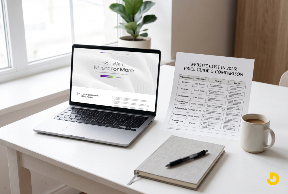
How Much Does a Website Cost in 2026? A Full Pricing Breakdown
A professional website costs between $150 and $50,000 in 2026. The exact price depends entirely on who builds it and what specific features you need to launch.
Published On: July 16, 2026
Published By: Designocracy
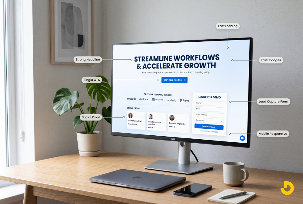
A high-converting landing page is a focused, standalone page built around one goal and one call to action. It converts because it delivers a clear headline that matches the visitor's intent, a single compelling offer, strong social proof, a fast mobile-first design, and a friction-free form. The best landing pages remove navigation, cut distractions, and answer the visitor's biggest objection before asking them to act. Most high-performing pages convert between 5% and 12%, well above the roughly 2% to 3% average.
Most landing pages fail for the same reason. They try to do too much.
A visitor lands on your page ready to act, and instead of one clear next step, they find a navigation bar, three competing offers, a wall of text, and a form asking for their life story. So they leave. That is the difference between a page that quietly bleeds ad spend and a landing page that turns clicks into customers.
This guide breaks down exactly what makes a high-converting landing page, the elements every one shares, real examples of what works, the mistakes that kill conversions, and how to test your way to better results.
A landing page is a standalone page built for a single purpose: to get one specific action from one specific audience. That action might be booking a demo, downloading a guide, starting a free trial, or buying a product.
Your homepage is different. A homepage is a hub. It introduces your brand, explains everything you do, and sends visitors in many directions. That is exactly why homepages make poor landing pages.
Landing page vs. homepage: what actually changes
| Attribute | Homepage | Landing Page |
|---|---|---|
| Goal | Explore and explain | One conversion |
| Navigation | Full menu | Removed or minimal |
| Audience | Everyone | One specific segment |
| Message | Broad brand story | One focused offer |
| Calls to action | Many | One, repeated |
| Traffic source | Organic, direct, brand | Ads, email, campaigns |
| Typical conversion rate | 1–2% | 5–12% |
Send paid traffic to a homepage and you pay for a click, then give the visitor twenty ways to get lost.
Every landing page that consistently converts shares these building blocks. Missing even two or three is usually where the leak is.
Your headline is the first thing a visitor reads and the fastest way to lose them. It has one job: confirm they are in the right place.
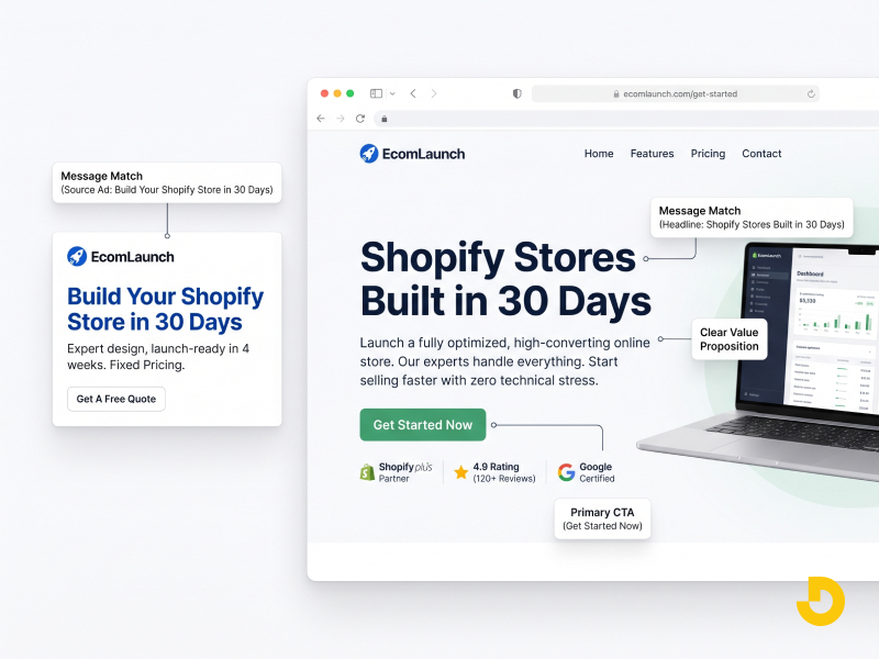
The most powerful principle here is message match. If your ad promised "Shopify stores built in 30 days," your landing page headline should say something close to that, not "Welcome to our agency." When the ad and the page say the same thing, bounce rates drop immediately.
✕ Weak: "Innovative Digital Solutions for Modern Brands"
✓ Strong: "Get a Shopify Store That Sells, Live in 30 Days"
The second one tells a visitor what they get and when they get it.
Your headline hooks. Your subheadline explains. Use one or two lines to clarify who the offer is for and what makes it different. This is where you answer the silent question: "Okay, but why you?"
A high-converting landing page has exactly one goal. Not three. One. That means one primary call to action, repeated down the page: once above the fold, once in the middle, once at the end.
Avoid vague buttons like "Submit" or "Learn More." Use specific, active language:
Specific beats clever every time. And make the button visually unmissable — high contrast, generous padding, plenty of white space around it.
Ask a visitor to do two things and they usually do neither. This is called the attention ratio: the number of things a person can do on your page versus the one thing you want them to do. Ideally it is 1:1. Strip out the navigation menu. Remove footer links that lead away. The only exit should be the conversion.
Visitors do not care that your platform has "advanced modular architecture." They care that it saves them ten hours a week. Turn features into outcomes:
Feature: Custom-coded, not template-based.
Benefit: Your site loads faster and looks like no one else's.
Keep paragraphs short. Use subheadings, bullets, and bold text so a skimmer can understand your offer in fifteen seconds.
People look to others before they act. Social proof is often the single element that lifts conversions the most, because it answers the visitor's real objection: "Can I trust you?"
Place proof directly beside your call to action. That is where doubt peaks and reassurance pays.
Every extra form field costs you conversions. Ask only for what you genuinely need right now. For most lead-gen offers, a name and email is enough — you can qualify later. Reduce anxiety near the form with a one-line privacy note and clear expectations ("We'll reply within one business day").
Most landing page traffic now arrives on a phone. If your page takes more than a few seconds to load, a large share of visitors leave before they see your headline. Speed is not a technical detail; it is a conversion feature.
Design should guide the eye, not decorate the page. Your headline should be the biggest element. Your call-to-action button should be the brightest. Everything else supports. Use white space deliberately, and show the product or result in a hero image or short demo video.
Instead of copying any single brand, look at the patterns that consistently win across categories.
Four landing page patterns that convert
| Page Type | The Winning Pattern | Why It Converts |
|---|---|---|
| SaaS free trial | Outcome headline, short demo video, one "Start Free Trial" button repeated 3×, customer logos, two-field signup. | The visitor sees the product working, trusts it because peers use it, and faces almost no barrier to trying it. |
| E-commerce product | Lifestyle hero image, benefit headline, star ratings under the product name, shipping reassurance, sticky "Add to Cart" on mobile. | Answers the two questions every shopper has — will I like it and can I trust this store — right at the decision point. |
| Service lead-gen | Problem-led headline, three benefit blocks instead of a service list, one case study with a hard number, testimonials with faces. | Leads with the pain, proves the fix with evidence, and makes the next step feel small and free. |
| Webinar / lead magnet | Specific promise, bullet list of what you'll learn, host photo and bio for authority, two-field form. | The value is concrete, the credibility is visible, and the ask is tiny. |
Notice what every pattern shares: one goal, one action, visible proof, nothing competing for attention.
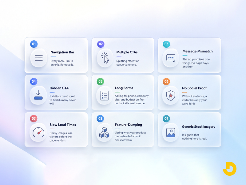
A landing page is never finished. The highest performers are the ones that get tested. Start with A/B testing one element at a time so you know what caused the change. The elements worth testing first, in order of typical impact:
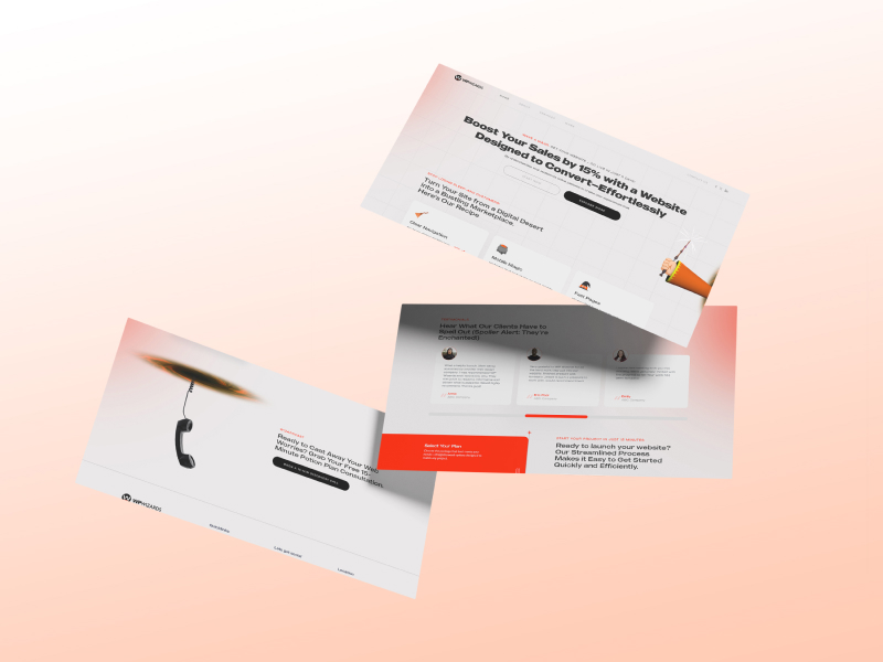
Watch behavior, not just numbers. Heatmaps show where people click and how far they scroll. Session recordings show where they hesitate. Analytics tell you what happened; these tell you why.
Track conversion rate, bounce rate, time on page, form abandonment, and cost per conversion. A page with a lower conversion rate but higher-quality leads may still be the winner. Run one test at a time, give it enough traffic to reach significance, and keep a record of what you learned. Small, compounding gains beat one big redesign.
A high-converting landing page is not a design trend. It is a discipline: one audience, one promise, one action, and proof that you can deliver. Strip away everything that does not serve that, and your conversion rate follows.
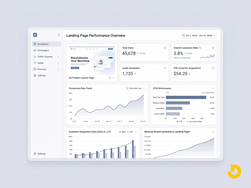
If your traffic is arriving but your pages are not converting, the problem is almost always structural, not cosmetic. At Designocracy, we design and build conversion-focused landing pages and run CRO programs that turn existing traffic into revenue, combining UI/UX design, custom development, and testing to lift the numbers that matter.
Get a restaurant website built to fill tables, not just look good.
Book Your Free Consultation